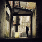
This is a gorgeously-composed shot, isn’t it? It’s nearly monochromatic, all buff and black, reducing everything to structural shapes, including John Watson. His head/face hardly show: it’s all about his body. His body that is shown with so much of the frame that surrounds him above his head that we cannot escape the message: too short. The ladder, so far over his head, is almost insignificant; what is significant is that dark continuation of line on the left of that square that leads our eyes to that ladder, the total vertical extent of which measures up so much greater than the tiny figure on the right.
And those frames. The dark surrounding, the first light frame, and then another dark frame to set the figure off. They spiral the eye in while retaining the tension between the two sides of the photo, the two participants, the stairs and the figure. So much action for such a static shot! And just to reinforce the message, the downward-slanted drainpipe in pale buff, angling down from the ladder to the (did you notice that he’s so short) figure.
That’s some visual storytelling right there, friends. Master class.

Just another WordPress site
